
Using the Dashboard to Gain Insights
View the dashboard to access high-level insights and reports to confidently understand your RCM lifecycle
The Revenue Recovery Dashboard serves as your central command center for monitoring claim denial patterns, identifying recovery opportunities, and tracking financial performance across your revenue cycle management process. This comprehensive view empowers different personas to make informed decisions and optimize their workflow.
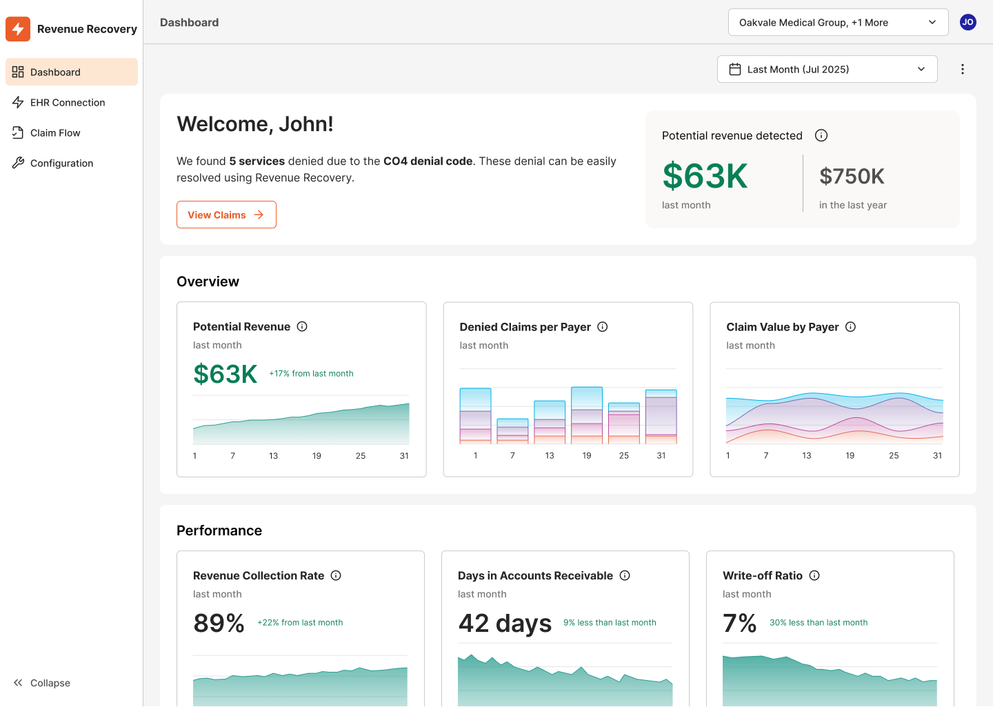
The dashboard provides personalized insights with a welcome banner that highlights high-value claims requiring immediate attention, helping users prioritize their work based on potential revenue impact.
Leveraging the Dashboard
The Revenue Recovery Dashboard supports both internal operations and external reporting requirements:
Executive Reporting - Share dashboard links with stakeholders for real-time access to performance metrics, or export data for board meetings and financial reviews.
Operational Meetings - Use the dashboard's print functionality to create physical copies for team discussions, strategic planning sessions, and performance reviews.
Performance Monitoring - Leverage the date range selector and organization picker to customize views for different time periods and organizational units, enabling targeted analysis.
Strategic Planning - Use trend data and comparative metrics to identify patterns, set performance targets, and measure progress against organizational goals.
Key Benefits by Persona
Revenue Cycle Managers gain executive-level visibility into denial trends, recovery rates, and operational performance to identify process improvements and resource allocation opportunities.
CFOs and Financial Leaders can quickly assess the financial impact of claim denials, track recovery progress, and monitor key financial metrics that directly affect cash flow.
Billing Analysts use dashboard insights to prioritize their workload, focusing on claims with the highest revenue potential and understanding payer-specific patterns.
Dashboard Sections
Each widget includes trend charts and comparative data to help users understand performance changes over time and make data-driven decisions.
The dashboard is organized into three main sections with focused widgets providing actionable insights:
Welcome Message
The Welcome Message provides personalized, situational insights that help users immediately focus on the most important details. This intelligent banner dynamically adapts based on current conditions identified by the Revenue Recovery platform's analysis engine.
Overview Section
Potential Revenue Widget - Displays the estimated value of recoverable revenue tied to unresolved or in-process denials (e.g., $235.8K last month). This metric helps prioritize high-impact work and forecast cash recovery opportunities.
Denied Claims per Payer Widget - Shows the volume of denied claims broken down by insurance provider (e.g., 433 claims last month). This visualization helps identify which payers contribute most to denial rates and where to focus resolution efforts.
Claim Value by Payer Widget - Presents the total dollar value of denied claims by each payer (e.g., $247.3K last month), highlighting where the highest financial impact lies and which payer relationships need attention.
Performance Section
Revenue Recollection Rate Widget - Tracks the portion of denied revenue successfully recovered, serving as a key indicator of financial performance and denial recovery effectiveness.
Days in Accounts Receivable Widget - Monitors the average number of days to resolve and collect payment on denied claims (e.g., 61 days). Shorter timelines improve cash flow and reflect process efficiency.
Write-off Ratio Widget - Shows the percentage of gross charges written off due to uncollectible denied claims during the period. This metric helps identify financial loss and justify automation investments.
Updated 9 months ago