
Understanding Dashboard Widgets
Detailed description of each widget and how calculations are made
The Revenue Recovery Dashboard provides actionable insights through specialized widgets designed for different aspects of revenue cycle management. Each widget displays key performance indicators, trend data, and comparative metrics to help healthcare organizations make informed decisions about their denial recovery processes.
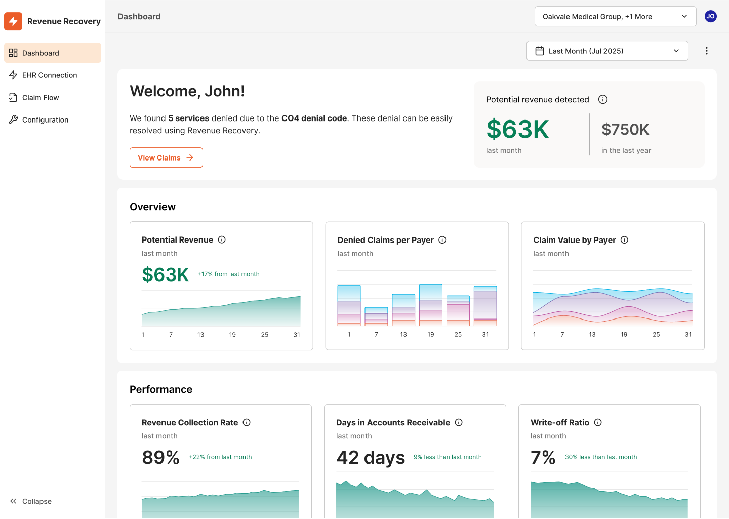
Welcome Message and Potential Revenue Detection
The dashboard begins with a personalized welcome message that dynamically highlights high-priority claims requiring immediate attention. This intelligent feature helps users quickly identify and prioritize work based on potential revenue impact.
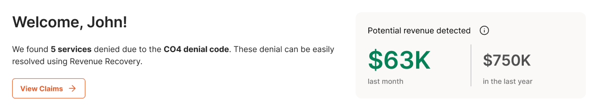
Example Scenario: A Revenue Cycle Manager logging in Monday morning sees a personalized message directing their attention to an impactful opportunity identified by the platform. This contextual guidance helps prioritize daily workflow and ensures critical claims don't get overlooked.
The welcome section also includes a Potential Revenue Detection summary showing quick metrics for the selected time period compared to annual performance, providing immediate context on recent denial activity.
Overview Section Widgets
The Overview section contains three primary widgets that provide fundamental insights into denial patterns and financial impact across your organization.
Potential Revenue Widget
The Potential Revenue widget displays the estimated value of recoverable revenue tied to unresolved or in-process denials, helping teams prioritize high-impact work and forecast cash recovery opportunities.
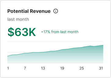
Data Presented:
- Total potential revenue for the selected time period
- Trend line showing daily changes in potential revenue
- Confidence-weighted calculations based on denial types and historical recovery rates
Example Scenario - Revenue Cycle Manager: Seeing substantial potential revenue over the selected time period with an upward trend indicates increasing denial volumes that require immediate attention. This manager can allocate additional staff resources to denial processing and set realistic recovery targets for the coming weeks.
Example Scenario - CFO: The trend data helps forecast cash flow impact and evaluate whether current denial processing capacity is adequate to maintain healthy accounts receivable levels.
Denied Claims per Payer Widget
This widget shows the volume of denied claims broken down by insurance provider, helping identify which payers contribute most to denial rates and where to focus resolution efforts.
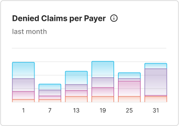
Data Presented:
- Total count of denied claims for the time period
- Stacked bar chart showing daily denial volumes by different payers (represented by colors)
- Trend patterns to identify increasing or decreasing denial rates
Example Scenario - Billing Analyst: Noticing that a specific payer accounts for the majority of denied claims allows the analyst to research payer-specific requirements, update billing procedures, or escalate recurring issues with that insurance provider.
Example Scenario - Revenue Cycle Manager: Pattern recognition across payers helps identify training opportunities for billing staff and guides contract negotiations with insurance providers showing consistently high denial rates.
Claim Value by Payer Widget
This widget presents the total dollar value of denied claims by each payer, highlighting where the highest financial impact lies and which payer relationships need immediate attention.
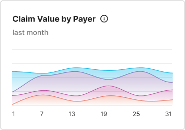
Data Presented:
- Total denied claim value for the time period
- Multi-line trend chart showing value trends by different payers
- Financial impact comparison across insurance providers
Example Scenario - CFO: The sharp upward trend at the end of the period indicates a significant increase in high-value denials. This data supports decisions about investing in additional denial management resources or implementing automated denial prevention tools.
Example Scenario - Revenue Cycle Manager: Identifying which payer lines show the steepest value increases helps prioritize relationship management efforts and focus on resolving the most financially impactful denial patterns first.
Performance Section Widgets
The Performance section contains three widgets that measure the effectiveness and efficiency of your denial recovery processes, providing key metrics for operational improvement.
Revenue Recollection Rate Widget
This widget tracks the portion of denied revenue successfully recovered, serving as a key indicator of financial performance and the effectiveness of denial recovery efforts.
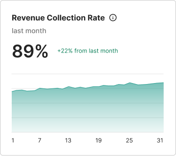
Data Presented:
- Percentage of denied revenue successfully recovered
- Trend line showing recovery rate changes over time
- Performance indicator for denial resolution effectiveness
Example Scenario - Revenue Cycle Manager: A low recovery rate with an improving trend indicates progress in denial resolution processes. This manager can use this data to demonstrate team performance improvements and justify additional training or technology investments.
Example Scenario - CFO: Low recovery rates signal the need for process improvements or additional resources in the denial management department. Trending data helps evaluate the ROI of denial management initiatives.
Days in Accounts Receivable Widget
This widget monitors the average number of days to resolve and collect payment on denied claims. Shorter timelines improve cash flow and reflect process efficiency.
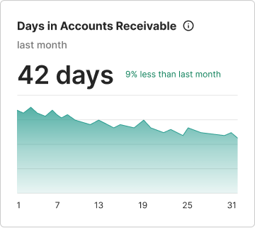
Data Presented:
- Average days for denial resolution
- Trend showing whether resolution times are improving or deteriorating
- Cash flow impact indicator
Example Scenario - Billing Analyst: An elevated average resolution time with an upward trend indicates delays in the denial resolution process. This analyst can investigate specific cases causing delays and implement prioritization strategies for aging denials.
Example Scenario - CFO: Extended accounts receivable days directly impact cash flow and working capital. This metric helps justify investments in denial prevention technology or additional staffing to reduce resolution times.
Write-off Ratio Widget
This widget shows the percentage of gross charges written off due to uncollectible denied claims during the period, helping identify financial loss and justify automation investments.
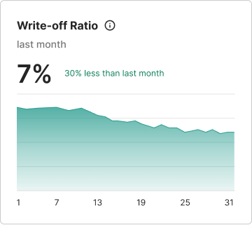
Data Presented:
- Percentage of charges written off as uncollectible
- Trend showing whether write-off rates are increasing or decreasing
- Financial loss indicator for denied claims
Example Scenario - Revenue Cycle Manager: A high write-off ratio indicates that most denied claims are being written off rather than recovered. This critical metric signals the need for immediate process improvements, better denial management tools, or staff training initiatives.
Example Scenario - CFO: High write-off ratios represent direct revenue loss and justify significant investments in denial prevention and recovery automation. This data supports budget requests for training and solutions that can improve recovery rates.
Using Widget Data for Strategic Decisions
Each widget includes time period selectors and trend visualization to help users understand performance changes and identify patterns that require attention.
The combination of current metrics and trend data enables proactive decision-making rather than reactive problem-solving, helping organizations optimize their revenue cycle performance before issues become critical.
- Revenue Cycle Managers use widget data to allocate resources, set performance targets, and identify training needs
- CFOs and Financial Leaders leverage the metrics for cash flow planning, technology investment decisions, and regulatory reporting
- Billing Analysts rely on payer-specific data to prioritize work queues and identify resolution strategies